Space X Redesign
An American aerospace manufacturer and space transportation services company. Their goal is to reduce space transportation costs to make affordable spaceflight a reality and to enable the colonization of Mars.
My Role: Independent UX/UI Designer
Project Timeline: 2 Weeks
Tools: Sketch, Google Suite, Cloud App, Miro, InVision
Summary of the Project: SpaceX has introduced the concept of future space travel becoming reality but does not include enough content to draw engagement to their website. My goal was to improve the overall layout and include an interactive quiz to enhance user experience.
(Created in InVision & Keynote)
The Framework
Consisted of a 6 phase approach that I broke down into tasks to guide me forward. The purpose of the framework was to define the current problems of the SpaceX website in order to create the right solutions for users.
LEARN
I start by understanding the users and SpaceX needs. I find inspiration for different tasks and conduct desk research by searching, absorbing and listening to what the world is saying. This involves social listening, finding web data and auditing other sites for good and bad examples in order to begin identifying problems.
UX Audit
Identified parts of the website that cause problems and frustrations for users.
Competitive Audit
Looked into various websites in the market to gain insight as to how they stand out to create ideas on how SpaceX can better communicate value. We did an in-depth audit on the homepage of Boeing, and noticed SpaceX did a good job with following best practices in comparison to its competitors.
Social Listening
Went to social media to find out how people feel and what they want to experience on the SpaceX website.
We observed that users are anticipating an opportunity to travel to space via SpaceX.
(Twitter)
We noticed the price tag for a trip to space was not something everyone can afford. We implemented strategic ideas to make the website more engaging for all users.
(Twitter)
Data Analysis
Observed data on the internet that could assist me with potential feature ideas to create later in the framework. I noticed that the men to woman ratio for those who’ve traveled to space is highly male dominated. I began thinking of ways to incorporate a gender neutral design system.
Men/Woman In Space
DEFINE
I began to identify goals, objectives and strategy before I could start designing. In the define phase, I understood more about who the product users are and how they can better navigate through the website.
Problem Statement
A description of the issues that cause poor user experience and website success. It includes vision, methods and measurable goals that can lead to a solution.
SpaceX.com is intended to keep users informed of progress on projects, missions, rockets and rideshare opportunities to space. I observed that the product is male dominated and is vague with explaining space flight exploration to the general public. This causes a lack of user engagement and traffic to the website. Implementing a gender neutral design and incorporating an engaging quiz will drive traffic through the website and increase user engagement thus causing less frustration.
Task Flows
A click-by-click process of interacting with features on the website. It is the series of steps that a user takes in order to complete a task. I’m able to understand possible user pain points through the creation of a flow chart.
Lofi fidelity flow chart
Users did not understand the terminology nor could they afford the price of a flight to space. This drove many users away with no intention on returning to the website.
High fidelity flow chart
Because the booking process for space travel is not realistic for many, it was key to identify the steps and useful information that is required for travel in order to understand how I could engage users in other ways to engage with SpaceX.
Information Architecture
A proposed page to page breakdown of the information architecture on a macro level.
Sitemap Recreation: My goal was to recreate the current sitemap to give me a better understanding of what the birds eye view of SpaceX currently shows. This helped me notate ideas of how I could introduce gender neutral design and implement a quiz into the website.
DESIGN
Taking what I learned and defined in the previous two steps of the framework, I am now able to begin designing.
Screen Sketches
A way to communicate ideas with pen and paper in order to visualize ideas for the best design approach.
Wireframes
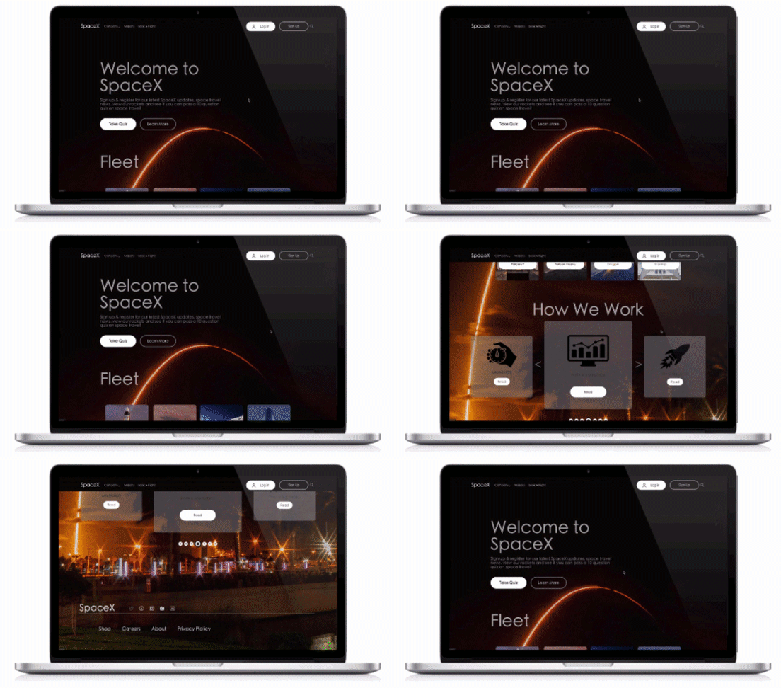
Creating digitized design that derived from the best possible hand sketches. A lot of iterating took place in order to decide on the best system for users. A focal point was to design according to best practices that makes it easy for the user to navigate and create elements that are familiar (back, x, next) & orientation (progress bar).
EXPERIMENT & ITERATE
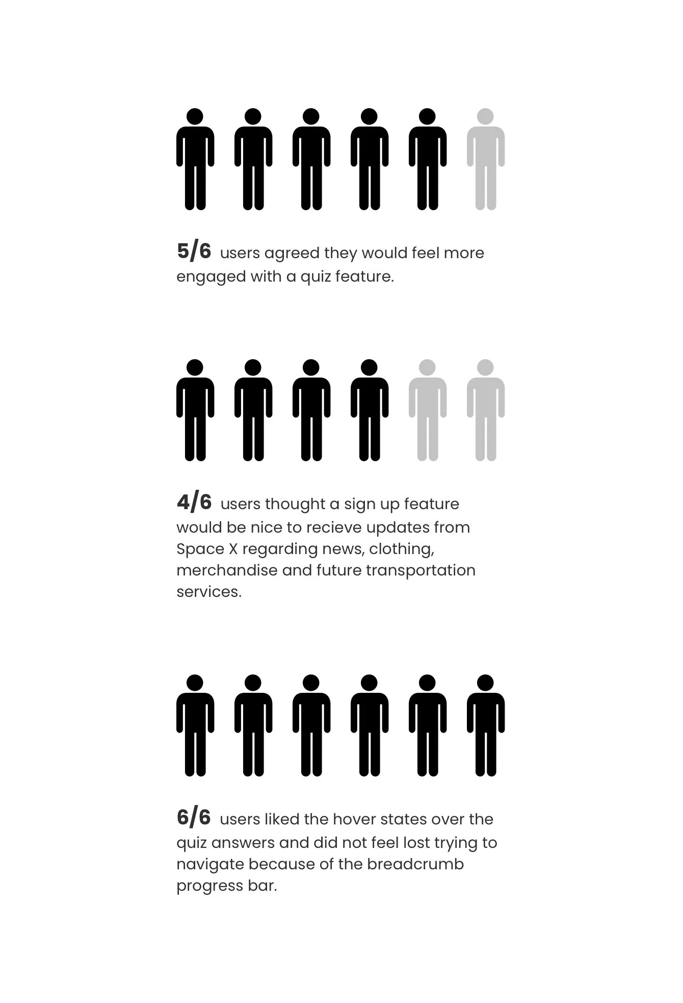
Tested with users to gain feedback in order to improve upon design decisions.
Prototype
I began to create the digitized task based flows in order to test wayfinding and navigation amongst others.
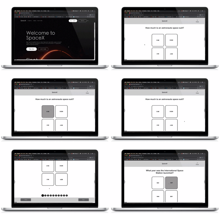
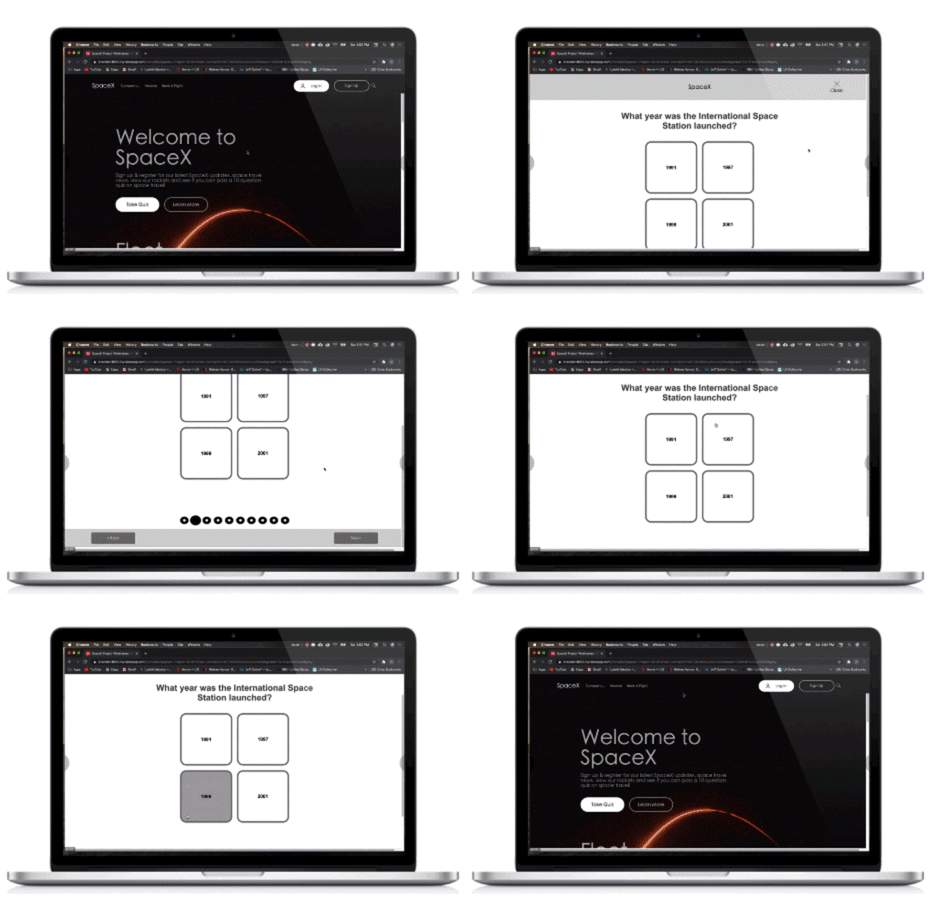
Prototype (Homepage - Take Quiz)
Primary CTA from homepage was “Take a Quiz.” This is the main action we want our users to do to capture more engagement with the site.
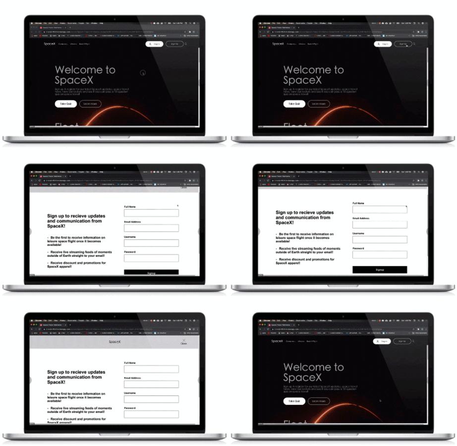
Prototype (Homepage - Sign Up)
Introduced a sign up form for users following Like W’s forms best practices to receive updates on news from SpaceX via email, streaming updates, shopping, travel details once they are available and more.
Prototype - (Quiz, hover states, carousel & homepage)
An interactive, fun and engaging quiz to learn more about those who visit SpaceX.com while also introducing a fun concept for everyone to enjoy. Hover states, carousels and easy way-finding in navigation to allow users comfortability as they continue through the quiz.
LAUNCH
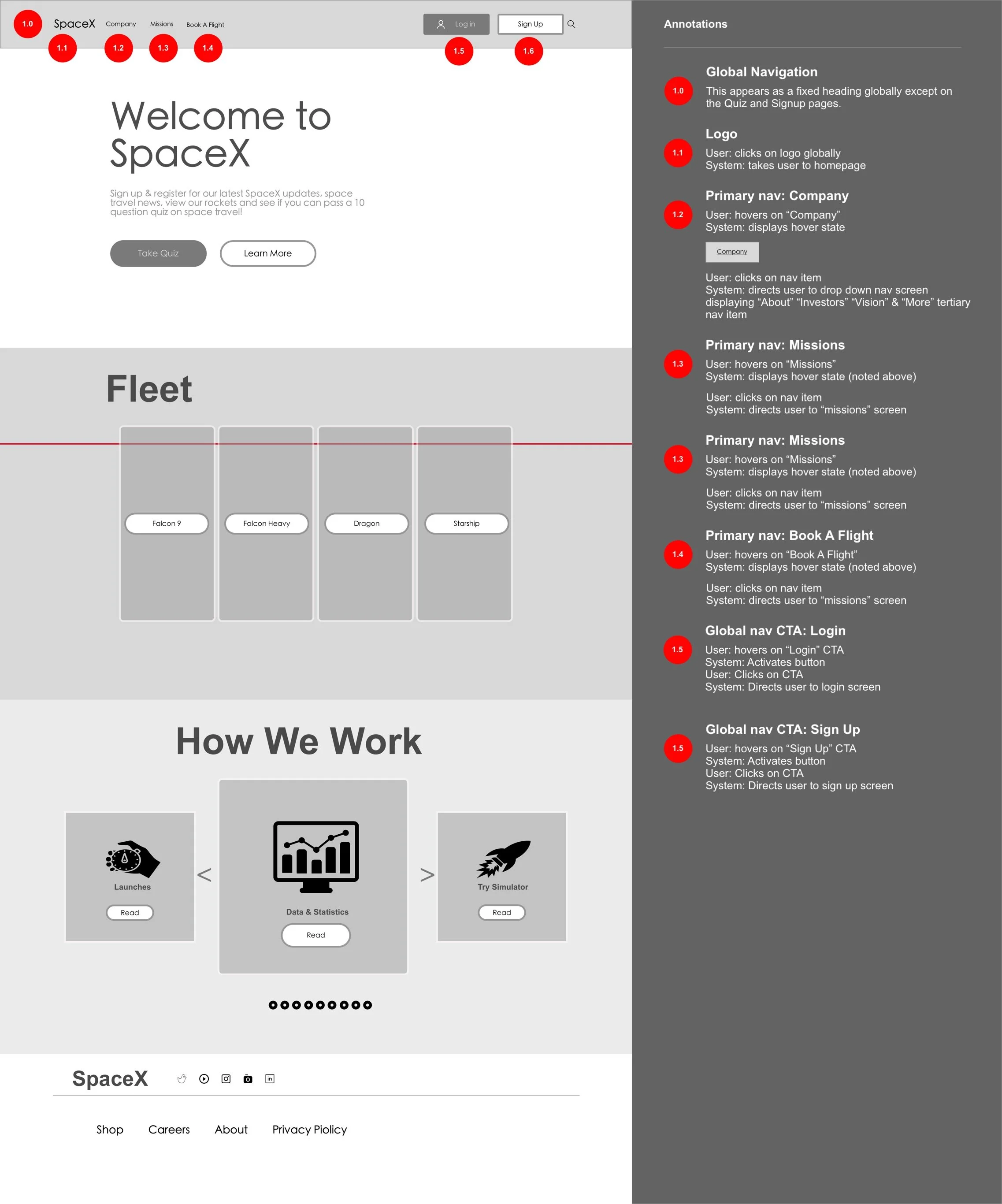
Annotations
Provided developers with brief written explanations to assist them with creating.
Final Takeaways & What’s Next
Space travel for the general population isn’t realistic yet and rideshare isn’t clearly understood on the site. Expanding ways to attract users to the SpaceX website in other ways, such as offering a fun and interactive quiz, will increase user engagement.
Implementing quiz questions that are aimed at designing around the needs or interests of woman in space will capture more attention.
Changing color and UI elements will enhance KPI metrics.
Adding a signup feature will capture new users and current users may be more enticed to visit the SpaceX website on a regular bases.
The overall layout of SpaceX works well but testing new global navigation and hamburger menu options could ease user frustration.

