Rub-A-Dub App | E-commerce
Rub-A-Dub is an e-commerce mobile car wash app that provides a car washing service for users. Designed to make the car washing experience easier and more accommodating for users by providing the service to be done at their location.
My Role: Lead UX/UI Designer
Project Timeline: 2 Weeks
Tools: Adobe XD, Google Suite, Cloud App, Miro, Overflow, Keynote
Summary of the Project: Rub-A-Dub is an e-commerce mobile car wash app designed to make the car washing experience easier and more accommodating for users by providing the service to be done at their location .
My Process
Incorporating Lean UX, Design thinking (IBM) & Hyper Island ideation methodologies, my framework guided me in the right direction to create a unique application.
Phase 1: LEARN
We wanted to learn more about the car washing industry as well as understand the emotions people feel about car washing. Through field and desk research, we conducted competitive audits, searched for inspiration for our product, sent out a survey to the world and led 1 on 1 interviews to find more insight towards thoughts and opinions of how to create an effective car washing application.
Competitive Audit & Inspiration
Looked over 20+ different websites to identify methods, patterns and discrepancies within their website or application. We analyzed what we found and began to decide what could be a takeaway for our product later on.
Crystal Clean Auto Detailing offers unique packages that include a car wash and detailing service. However, the website does not follow best practices.
In the global navigation, there are more than 7 tertiary options to choose from which breaks the best practice of having no more than 5-7 items.
The hierarchy within the body copy is inconsistent. There is also too much body text within the homepage which could overwhelm users from the very beginning.
Petsmart offers a breadcrumb progress bar which is a necessity to keep users engaged and not lost through the purchasing process. This drives user satisfaction and eases the stress of going through the motions of purchasing.
Offering an interactive calendar to set up an appointment date is also an effective way to not loose user focus. By offering a tappable day by day calendar that shows dates, it will speed up the set up process for the user.
Surveys
Not only is it cost efficient but surveys are an important step in obtaining large amounts of data from target users. Plus, it’s really fun!
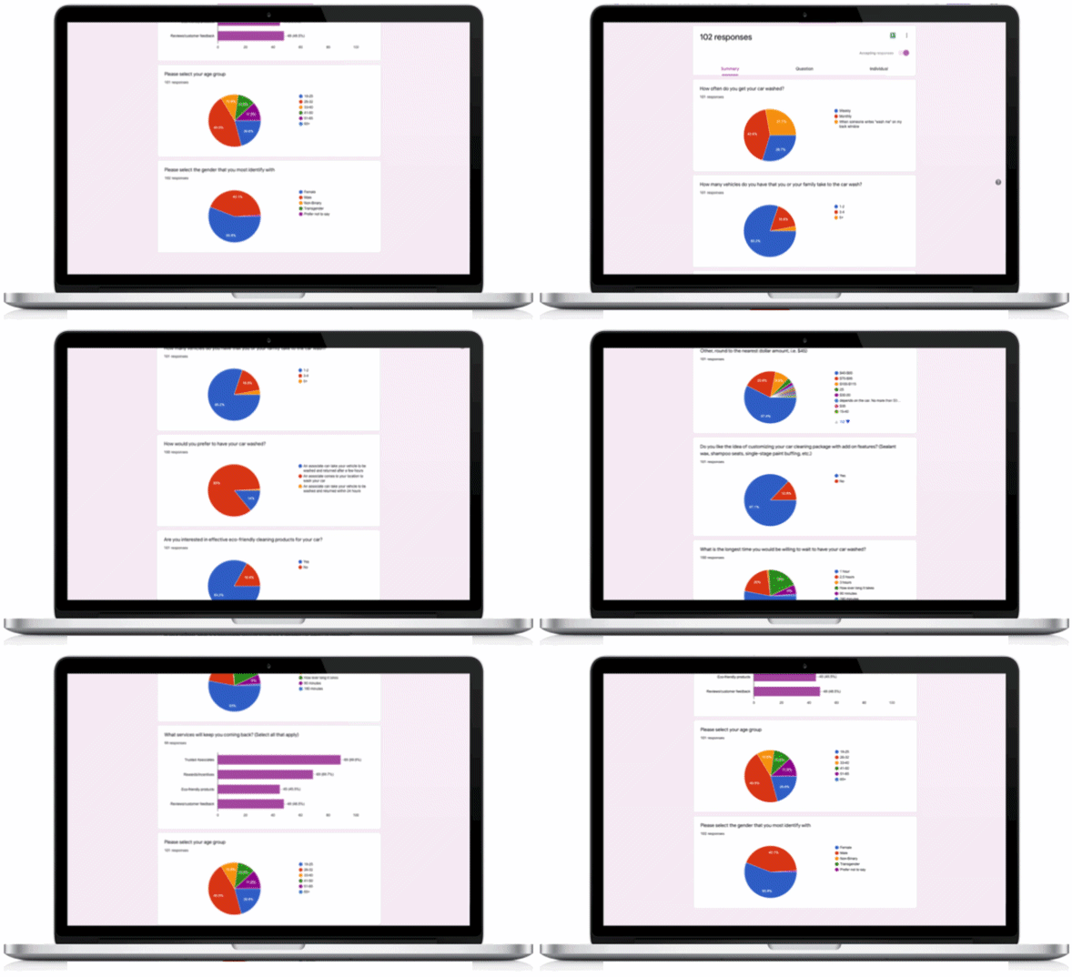
Key Takeaways (We received 102 responses is less than 48 hours)
85% of surveyors would prefer having an associate come to their location to wash their car.
84% of surveyors would prefer a washing service that offers eco-friendly purchase options and products.
87% of surveyors would rather go with a service that offers add ons and customizable wash packages.
1:1 Interviews
A great way to ask a target group of people for input on our product services based on their own experiences and expectations. We talked with 7 different individuals and received valuable input. Below are two quotes that stood out most.
“I would prefer the service to be entirely contactless. With all of the COVID-19 concerns in the world today, it is a necessity.”
“I love eco friendly products!! Can you please provide this within the service?”
Phase 2: DEFINE
After studying the market trends and listening to the world, we began to define who are users are and what features could be taken into consideration before designing our car wash service application.
Persona
I constructed a persona based on the survey results we captured in the learn phase to depict a target customer that could potentially utilize our service. My persona was used as a constant reference during the design process.
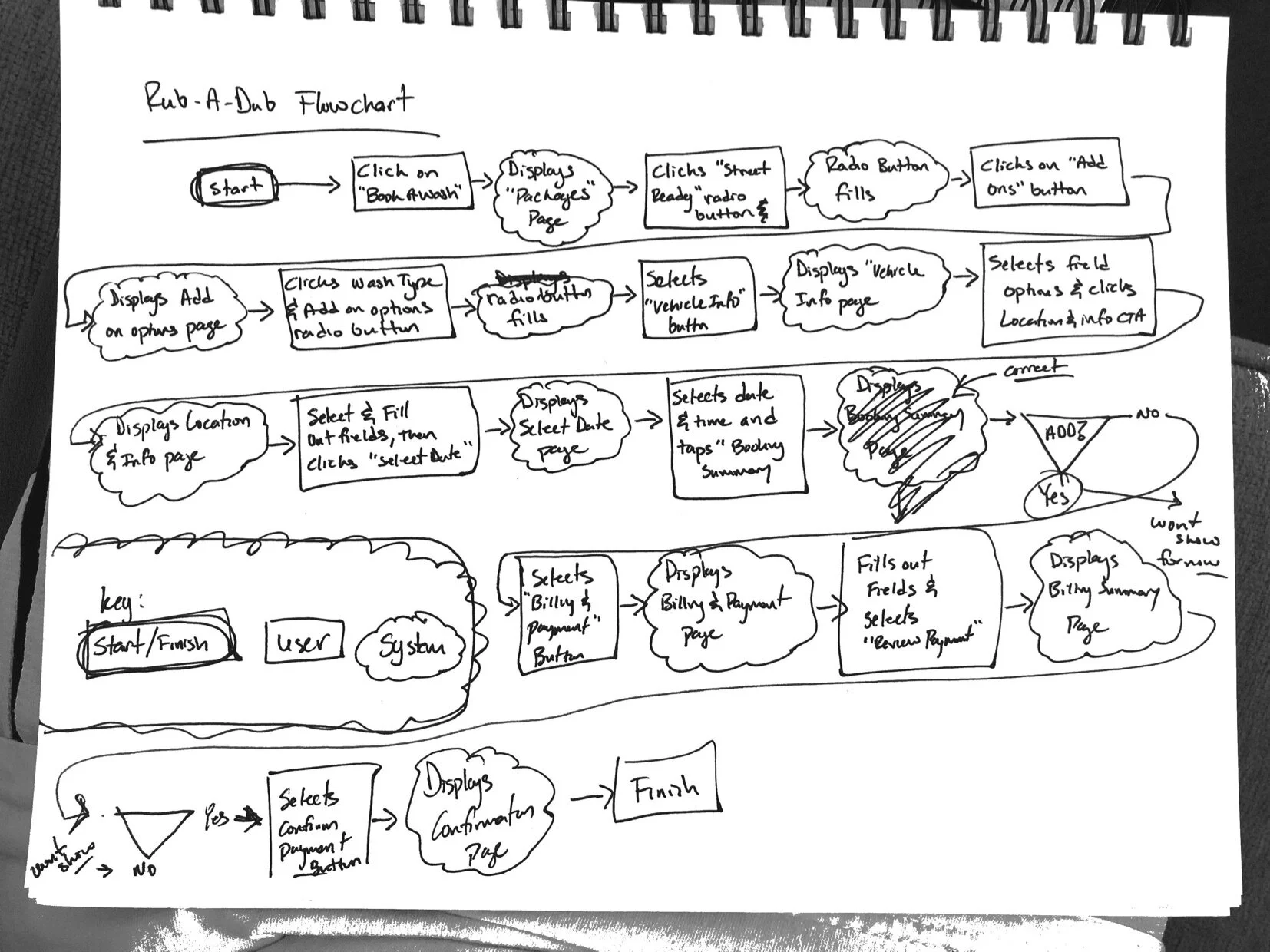
Low Fidelity Task Flow - Checkout Process
One of the most important parts of an e-commerce platform is to drive our users down the funnel smoothly during checkout. I drafted a step by step flow with pen and paper to show how users would purchase a car wash. It shows what the system displays after a user performs a certain task.
High Fidelity Sitemap
Our information architecture portrays the structure of our mobile application. Keeping our users at the front of every thought, we visioned our persona taking steps through each page efficiently.
Phase 3: DESIGN
Taking what we’ve learned and defined, we transformed the ideas and results we received into many iterations of design through sketching, wireframes and mockups. We conducted many rounds of user testing to ensure success.
Sketches
Another cost effective and time saving step is to draw out ideas of each page layout utilizing the concepts we identified in the learn and define phase. Following the Lean UX methodology, we were able to brainstorm through many iterations by listening to user input through testing.
Wireframes
We digitized our sketches which became our blueprint of each page, working and iterating on the layout, features and elements.
(Created in Adobe XD)
Moodboard
Visuals, Fonts & Elements.
Our goal was to create a slick and clean visual concept using a “Fast & the Furious” theme, incorporating purple and turquoise to portray power and elegance with in our design.
Mockups
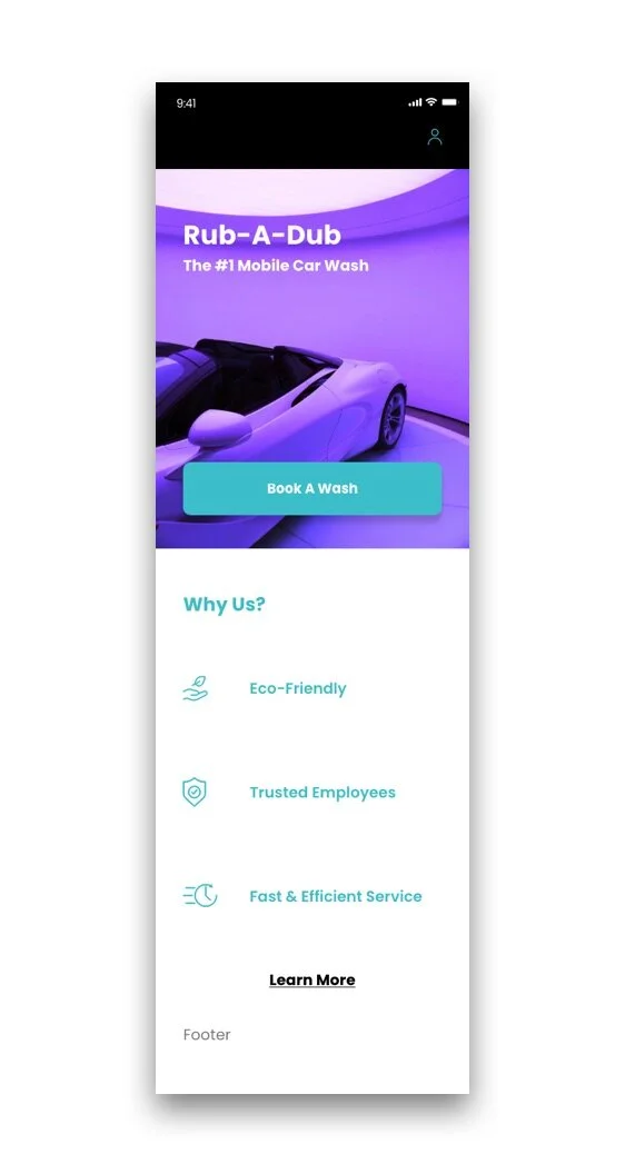
Adding color to the homepage and testing with users to get a feel for the best color scheme gave us insight to a more realistic representation of our product.
Final Homepage Mockup
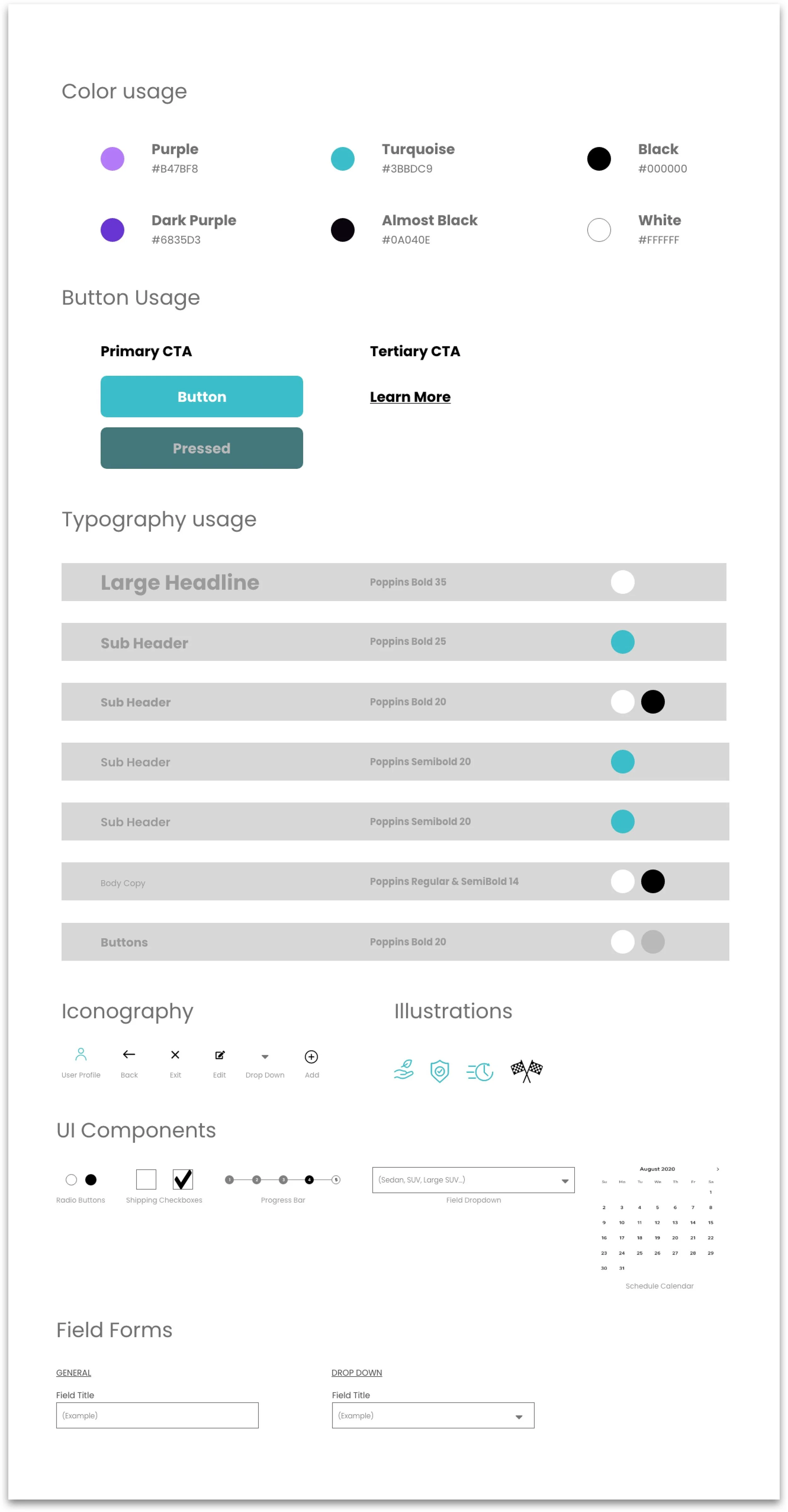
Design System/Style Guide
In order to keep our visual style consistent throughout the entire application, we created a design system that consisted of our standard elements.
Phase 4: EXPERIMENT
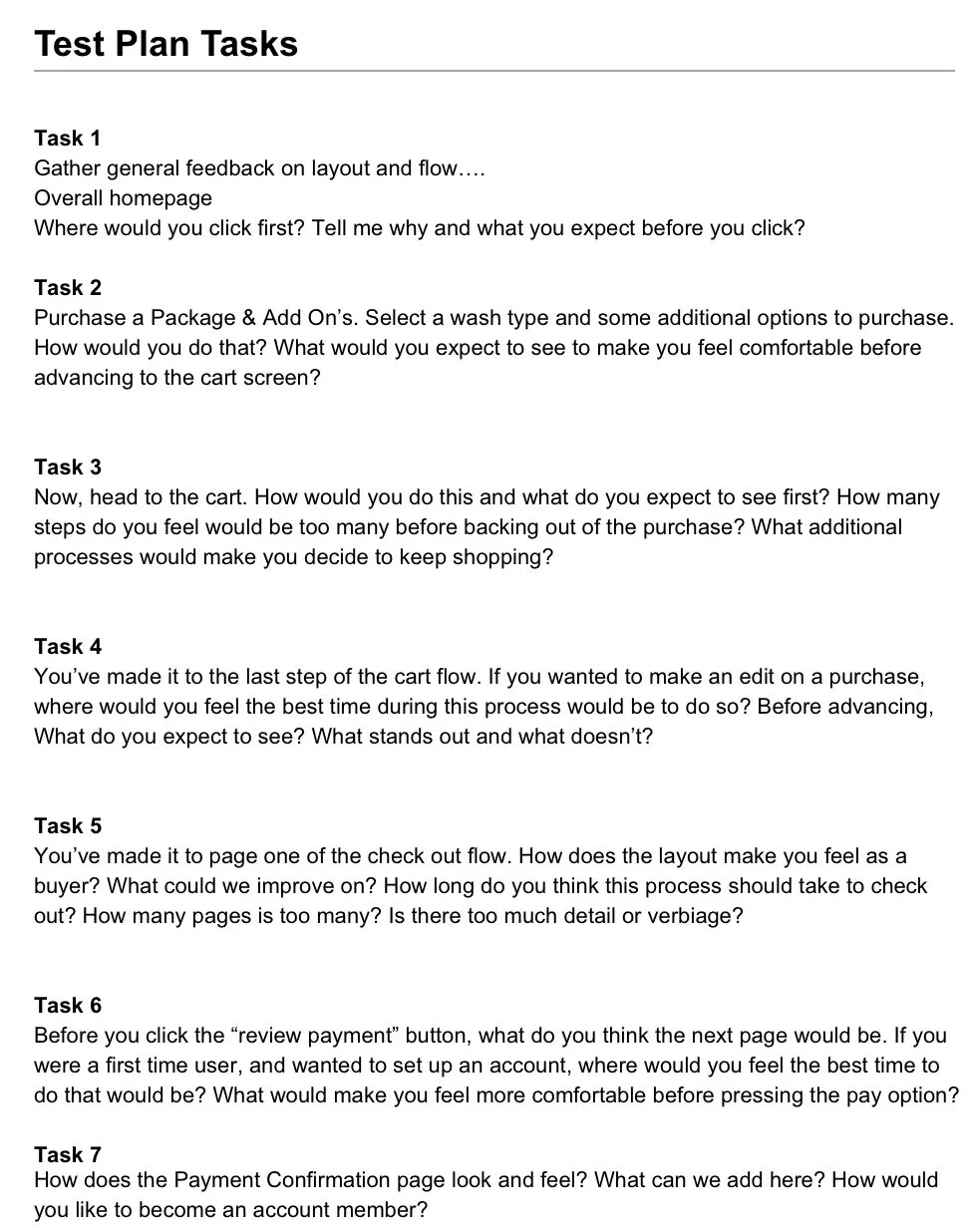
Test Plan
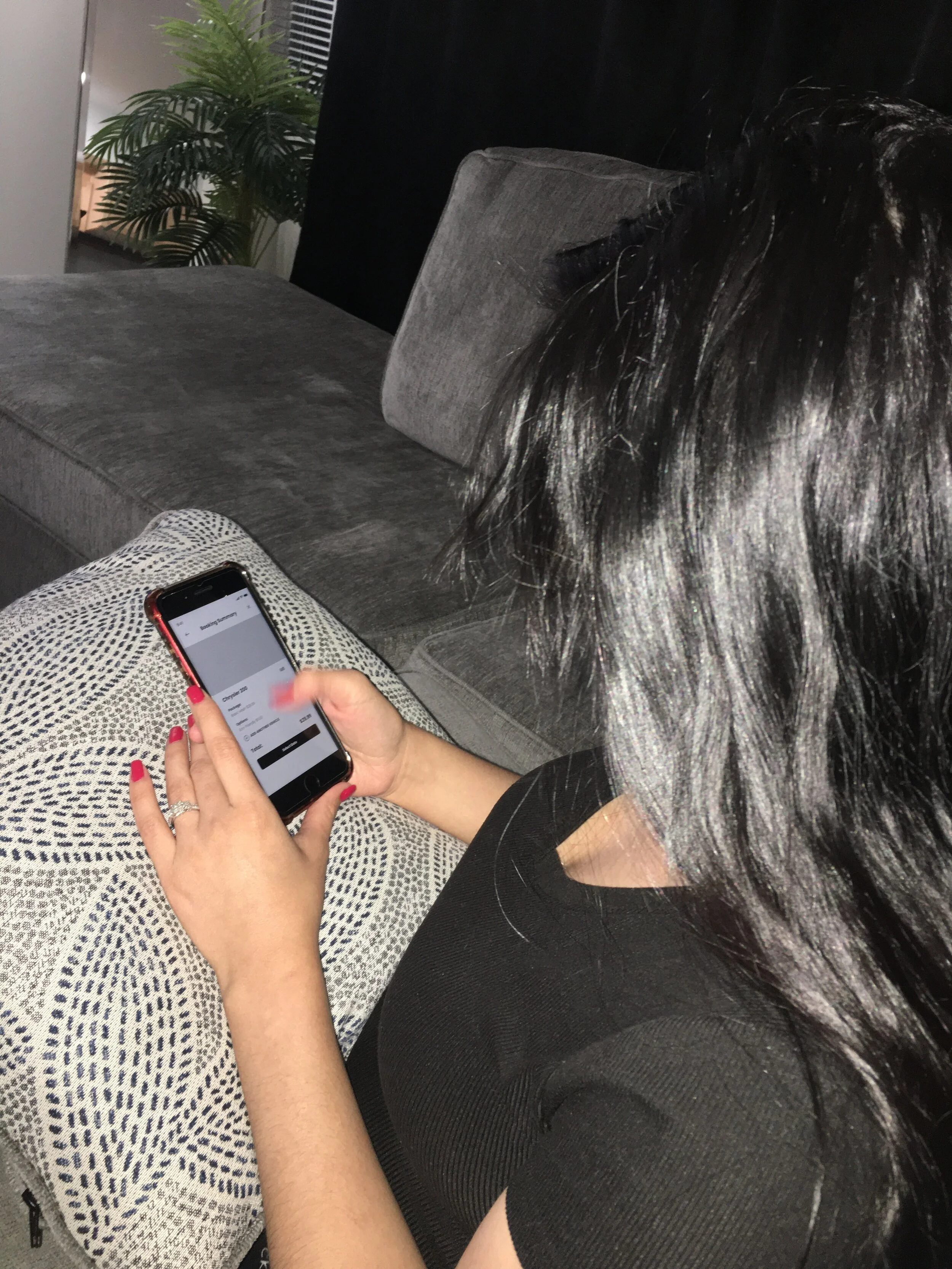
To ensure that the user flow down the sales funnel was seamless, we needed to solidify and gather measurable results through user testing. We created a plan of action that entailed a series of tasks to understand how our users would navigate through the flow. We also observed and listened to expressions and reactions of our layout design to ensure that it was intuitive and user friendly.
Test Goals
Test how users would navigate through the cart and checkout flow.
Test the flow and navigation from the homepage and button usage.
5 users
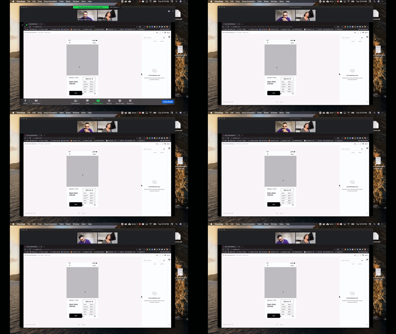
1:1 online test through Zoom
1 round of 10 minutes
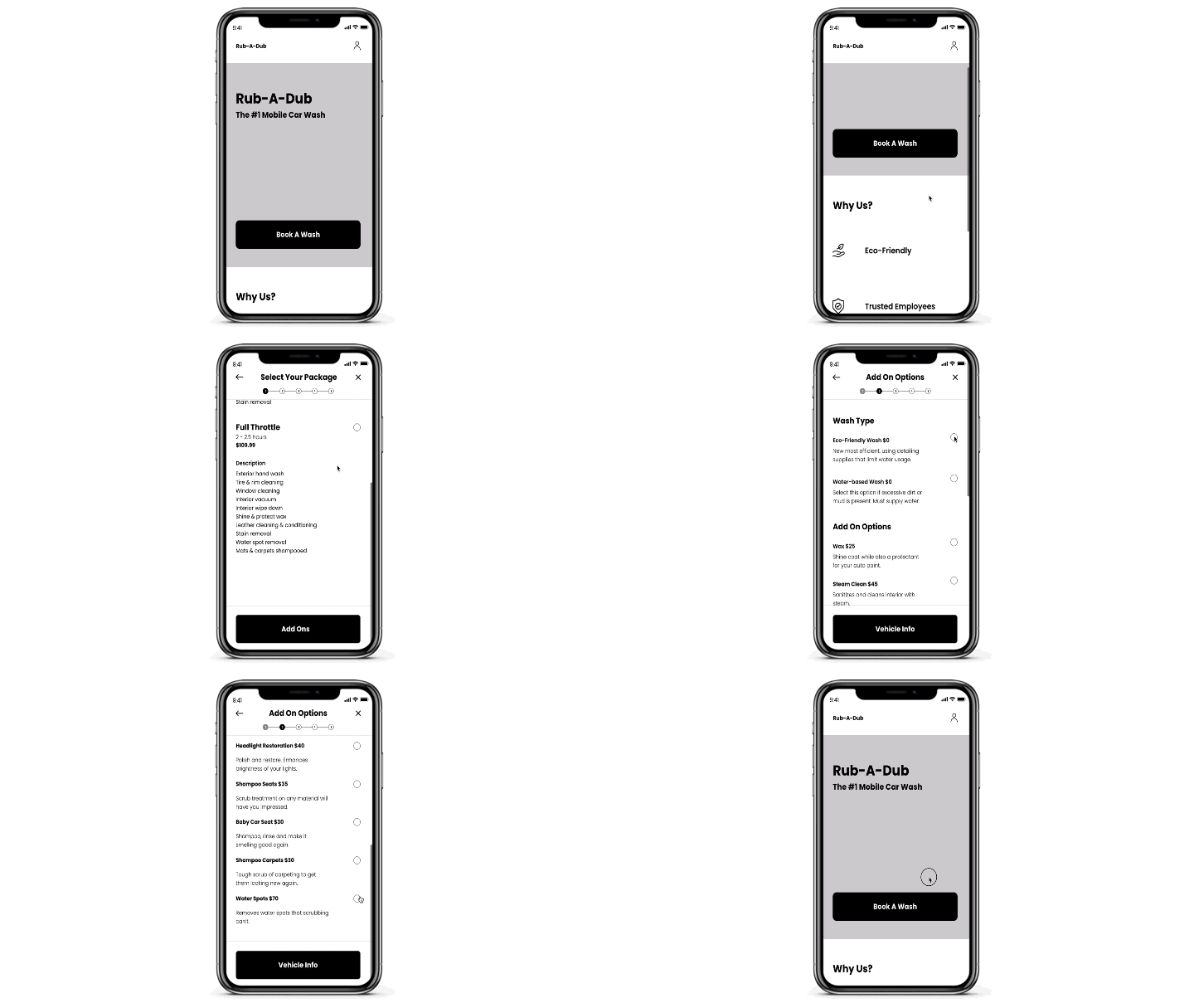
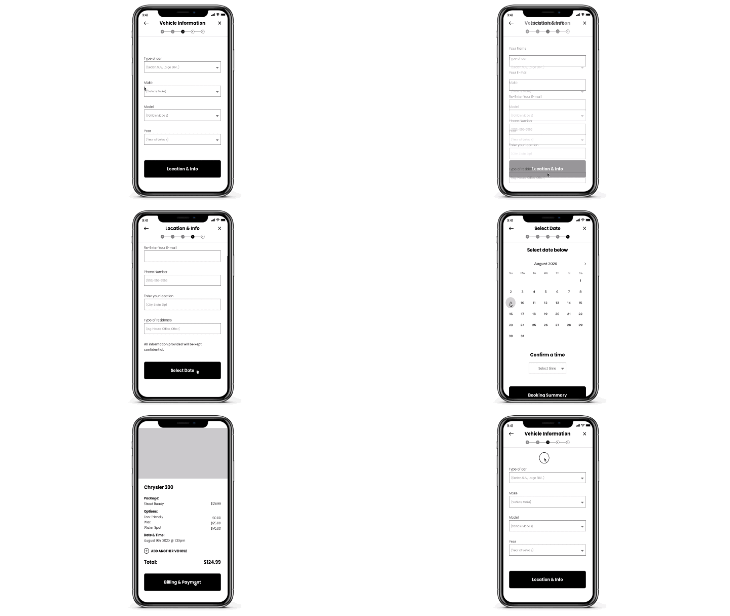
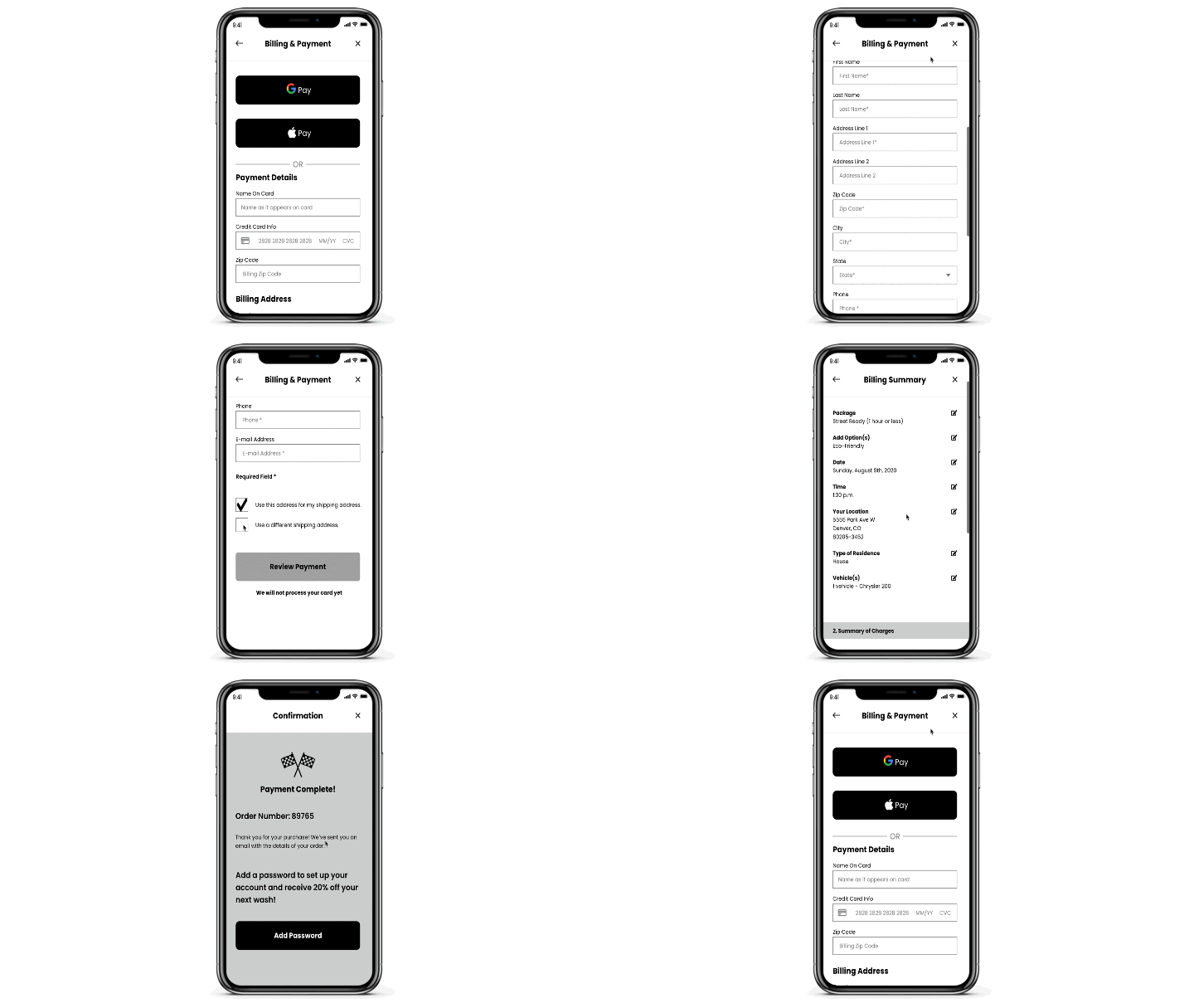
Wireframe Prototype
A visual representation of our wireframes for users to test.
Homepage to Category & PDP Flow
From the homepage, users clicked the primary CTA “Book a Wash” which navigates them to the category and PDP pages. We included a progress bar, back and close buttons to keep our users confident and in control when navigating through the wizard. We also included 24x24px radio buttons and ensured that each element had a 44x44px tappable area, which follows best practice for app design.
PDP to Set Up & Info Page
As our users navigate down the funnel to select the services they need, we followed Luke W’s forms best practice of one column fields with left aligned text above the fields to ensure less eye scanning around the page.
Checkout, Billing Summary & Confirmation
Continuing with Luke W’s forms and fields best practices, users will finally reach the confirmation page. We wanted to attract more business from customers, so we included a small incentive to create an account with Rub-A-Dub. Because we had all of the user info we needed, all we needed the user to do was select the “Add a Password” CTA on the final screen to set up an account and receive 20% off their next service.
Phase 5: ITERATE
Testing
After experimenting, testing, then more experimenting we continued to iterate our design with users to evaluate our decisions.
Phase 6. LAUNCH
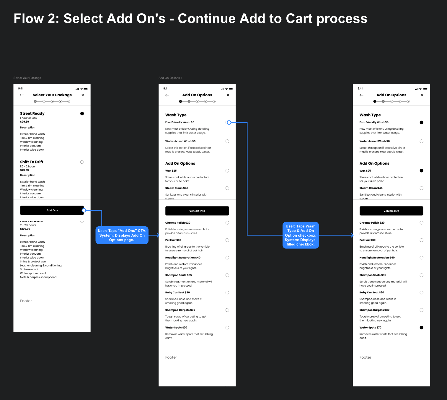
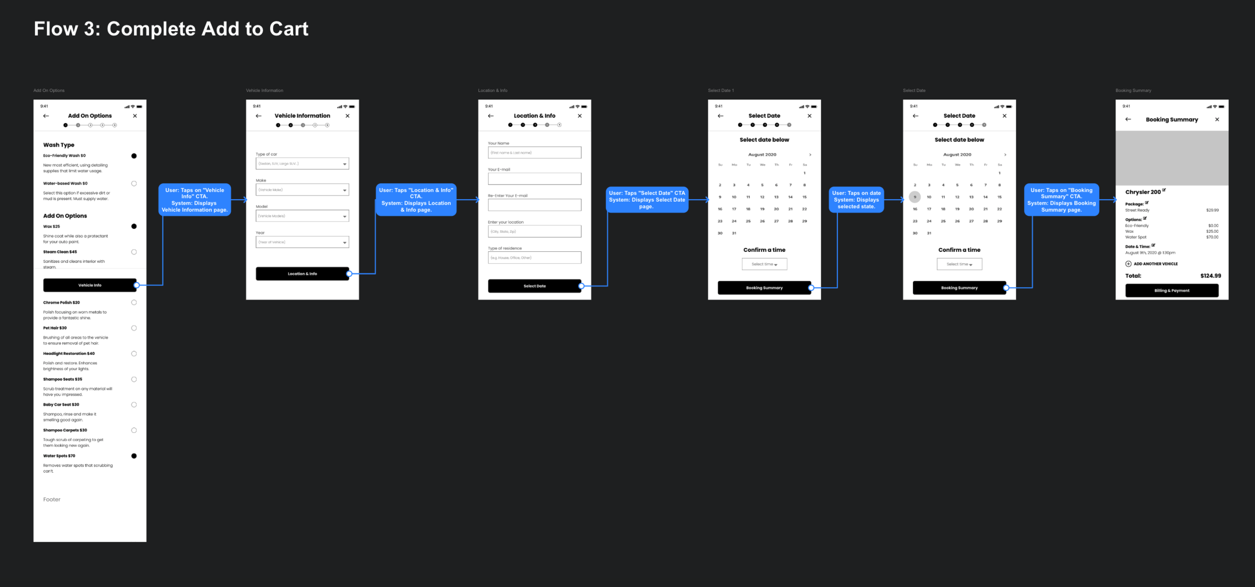
Preparing documentation and user/system flows to ensure our development team had what they needed to begin creating our application.


